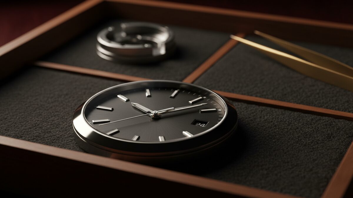
Counterfeit and “frankenwatched” luxury watches have gotten alarmingly good. The casework, the dial printing, the movement housing — all close enough to fool a fast glance. What separates an experienced dealer from a confident amateur is not knowing what's there. It is knowing where to look. Twelve tells, in order of how often they catch a problem.
1. The dial font, under magnification.
The dial is the first thing the eye lands on, and the first thing a counterfeit gets close-but-wrong. Authentic dials use specific factory fonts with consistent kerning, baseline alignment, and printed depth. Most fakes get one of these dimensions slightly off. Look for letter spacing that varies between the same character (an “OO” with two different gaps), a baseline that wanders by a fraction of a millimeter across “AUTOMATIC” or “OFFICIALLY CERTIFIED,” and printing depth that looks subtly raised or recessed compared to known references for the same dial generation.
2. Lume aging across hands and markers.
Tritium and Super-LumiNova age uniformly across all luminescent surfaces of the same era — meaning the marker dots and the hand fills should patina at the same rate. A re-lumed dial or an aftermarket hand-set creates a mismatch: hands stark white against creamy markers, or vice versa. Looking from a side angle under raking light makes the comparison stark. A piece where one of the two has been replaced is honest mileage you should know about; a piece where the seller hasn't disclosed it is a problem.
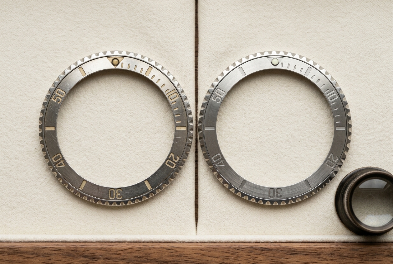
3. Bezel insert color tone.
Aged ceramic and aluminum bezels develop predictable color drift over time. A 1990s-era Submariner insert reads slightly purple-blue against the original-period charcoal. A 2010s ceramic stays sharper. A replacement insert in the wrong era reads as a half-shade off — close, but not native. Compare against well-documented production-year photographs from auction-house catalogues; the catalogues are the closest thing to a public-domain reference library on this material.
4. Crown profile against the case-back era.
Crowns evolved across reference generations. A Triplock crown on a watch whose caseback says it shipped pre-1970 is wrong. A Twinlock on a modern reference is wrong. The crown shape, height, and the engraved logo profile all carry generational fingerprints. The mismatch is rarely an outright fake; more often it's a service replacement that was specified incorrectly. Either way, the value of the piece changes.
5. End-link fit at the lug.
Authentic bracelet end-links sit flush against the lug, with even gaps to either side. Aftermarket end-links — even high-quality ones — typically sit with a perceptibly larger gap on one side, or with a tiny height mismatch where the end-link sits 0.1–0.2mm proud of the case. Once you have seen this once, you can't unsee it. Run a fingernail along the case-to-end-link join: a continuous, even tactile surface is correct; a step you can feel is not.
6. Case lug sharpness.
Over-polishing is the most common condition fault on pre-owned luxury watches. Originally crisp, knife-edge lug profiles get soft and rounded after one or two trips through a sloppy polish. The brushed-to-polished demarcation lines blur. The case loses 0.3–0.5mm of metal. A factory-sharp case looks geometric; a polished-out case looks “soft” and slightly bloated. Side-angle photographs from a 30-degree elevation reveal this immediately. (For the foundational version of this conversation, our piece on buying a pre-owned Rolex walks through condition forensics in more detail.)
7. Caseback engraving depth and font.
Factory casebacks use pantograph or laser engraving with consistent depth and a recognizable font. Counterfeit and refinished engravings show inconsistent depth (some characters deeper than others) or a font that's close-but-not-correct (slightly different stroke width, slightly off serifs). A 10x loupe over a known-good comparison reveals it in two seconds.
8. Hand finishing — polish vs brushed transitions.
Modern luxury watches mix polished and brushed finishes on the case in deliberate patterns. The transition lines should be sharp — a clear edge between the two finishes, not a gradient. Refinished cases blur these transitions. Refinished cases also tend to dull the polished surfaces (a mirror polish becomes “satin-mirror” because not enough working time was put in). Hold the case under a single point-source light: original polished surfaces throw a clean reflection, polished-out surfaces throw a hazy one.
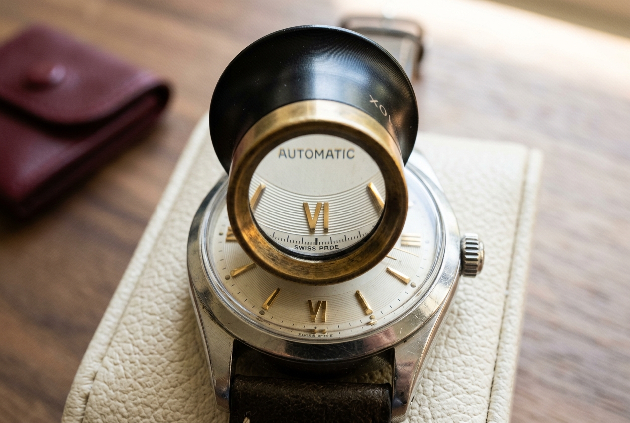
9. Cyclops magnification.
The Rolex date cyclops magnifies the date wheel to 2.5x — the date character should fill the cyclops aperture nearly edge-to-edge. A counterfeit cyclops typically magnifies at 1.5x or 2x, leaving visible empty space around the date numerals. Look at the date through the cyclops and ask: does it fill the lens, or is there extra space around it? Extra space equals wrong cyclops. The fix on a counterfeit is non-trivial and rarely done well.
10. Crystal type by era.
Modern luxury watches use sapphire. Pre-1980s pieces from many makers (including Rolex) used acrylic. Acrylic crystals bow up gently at the center, can be polished out of light scratches, and feel slightly warmer to the touch. A modern-era reference with an acrylic crystal is wrong. A 1965 watch with sapphire is wrong (unless documented as a service replacement). The wrong crystal era is sometimes accidental — a watchmaker fitted whatever was on the bench — but it changes both authenticity status and value.
11. Movement signature under the loupe.
Authentic movements show consistent circular graining (“perlage”) on flat surfaces, sharp Geneva stripes (“Côtes de Genève”) on bridges, and clean polished bevels at corners. A fake or service-modified movement either uses machine finishing where hand finishing should be, or uses hand finishing in a slightly off direction (anglage that's the wrong width, perlage that's the wrong dot density). A watchmaker who handles fifty of these a year sees this in seconds. A first-time buyer can ask the seller to open the caseback for a photo — an honest seller will, a non-honest one won't.
12. The service stamp on the case-back interior.
Factory and authorized-dealer servicing leaves a small dated stamp on the inside of the caseback — a date code, a service-center identifier, sometimes a watchmaker's initials. Pre-owned watches with multiple stamps from reputable services tell a transparent history. A blank case-back interior on a vintage watch is a yellow flag (not a red one — some watches are genuinely unserviced — but it should be a question). A stamp from an unfamiliar service shop should prompt a quick lookup; a fake service stamp is the kind of detail counterfeiters often forget.
What twelve tells add up to.
If you check all twelve and find no flags, you have an authentic and well-preserved watch. If you find one flag, ask — many flags have honest explanations (a service replacement, an estate piece with no records, a one-off factory variant). If you find two or more flags without good answers, walk. The market has too many honest watches for sale to take a fight on a borderline one.
The desk we run authenticates dozens of luxury watches a month. We make these checks on every piece, every time — and we're happy to teach the eye to anyone who wants to learn it. (For the diamond-side equivalent of this discipline, see our companion piece on how a gemologist actually reads a GIA report.) Bring a watch by and we'll walk through it with you.